![handoff_logo [已復原]-04_edited.png](https://static.wixstatic.com/media/49790e_00932f181fdc49c8928af52f19a2c3a5~mv2.png/v1/fill/w_541,h_135,al_c,q_85,usm_0.66_1.00_0.01,enc_avif,quality_auto/handoff_logo%20%5B%E5%B7%B2%E5%BE%A9%E5%8E%9F%5D-04_edited.png)

.png)

ClearPath
Dashboard
About Project
Client
.webp)
Boston Climate Action Network is a nonprofit organization that organizes Boston residents and collaborates with other social justice allies to help pass the Building Emissions Reduction and Disclosure Ordinance (BERDO 2.0), to ensure the reduction of building’s greenhouse gas emissions and combat the climate crisis.
Project Statement
Aiming to provide a platform for BCAN members to understand the quality of data better, the changes over time, and how they correlate with buildings, owners, and locations.
Role
Project Manager and Lead UI / UX Design
Timeline
4 month
Design Challenge
Effective Data Visualization
Aiming to provide a platform for BCAN members to understand the quality of data better, the changes over time, and how they correlate with buildings, owners, and locations.
Balancing Detail with Accessibility
Providing detailed and meaningful data necessary for informed policy-making while ensuring the dashboard is accessible and understandable to a diverse audience, including those with different levels of expertise and abilities.
"How can we develop a data visualization dashboard that intuitively and accurately presents complex emissions data ?"
Context
This project is a capstone project of the Boston University Spark! UX Design X-Lab Practicum
70% of Boston’s greenhouse gas emissions come from buildings. To ensure we reduce our building’s greenhouse gas emissions and combat the climate crisis, we need to better understand which buildings are the biggest polluters and push them to change.
To this end, the Boston Climate Action Network helped pass the Building Emissions Reduction and Disclosure Ordinance (BERDO 2.0). BERDO requires large buildings to reach net zero emissions by 2050. It also requires owners of those buildings to report their energy use, water use, and carbon emissions.

Key Features
Filtering System
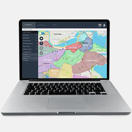
Allows users to apply multiple filters like building age, type, and energy star score to visualize specific subsets of buildings on the map related to emissions.

Interactive Map
Users can interact with the map to see the location of buildings, with icons indicating different statuses or categories. Clicking an icon reveals further details about the building. There is also a switch to turn on/off the neighborhood, it shows the areas for each neighborhood, so users can identify those buildings belong to which neighborhood.


User Engagement
The dashboard provides a personal space for users to save buildings, take notes, and track their activity, enhancing user engagement and personalized experience.
Compliance Tracking
A dedicated tab for monitoring compliance status of buildings, indicating whether they are verified, in progress, or non-compliant.

Trend Analysis
Users can switch to the 'Trends' tab to analyze data visualizations that correlate different variables like building age and neighborhood area with emission statistics.

4 Months from Vision to Launch
_edited.png)
Research / Interview
01
70% of Boston’s greenhouse gas emissions come from buildings. In Boston, energy use in stationary sources dominates, accounting for 69% of total emissions (4.3 MtCO2e). Commercial, industrial, and large residential buildings generated 51% of emissions (3.1 MtCO2e), while small residential buildings accounted for 19% of emissions (1.1 MtCO2e)
02
The Building Energy Reporting and Disclosure Ordinance (BERDO) requires all large buildings in Boston to report their energy use to the City every year. Buildings must also decrease their energy usage and carbon emissions or perform an energy assessment every five years.The goal is to reduce their emissions gradually to net zero by 2050
03
Energy efficiency: Minimizing the demand for energy through high-performance buildings, a shift to public and active transport, the purchase of clean energy, and waste diversion. Electrification: Transforming fossil fuel systems, such as vehicles and furnaces, to electricity powered by carbon-free energy sources.


Organized data from literature review and interview
Key Insights
Policy-Informing Data
"Data needs to guide policy-making."
What types of responses can they make from city policy level, state policy or community level to help them stay in the right direction?"
Building Overview
"We would like to know how many buildings are compliant or not."
"Would like to click at the building to see at a glance some of information about the building"
Data Visualization and Interaction
"Visual tools must highlight compliance stages clearly."
"We must see the trend of emissions to understand progress."
User Flow
_edited.png)
Design Process
I led the UX and UI design of BCAN dashboard to make sure our design is user-centered and would keep users engaged and motivated to better understand data and gain insights, which is our goal for this product.
Wireframe
I led the wireframes from low-fidelity to high-fidelity for usability testing. We identified the hierarchy of the information and made sure the content ties back to all the findings we derived from our research and testing.


Usability Test


“Love the filters, and details of buildings. I would see it as a useful tool, but the neighborhood switch can be more noticable”

“I like the visual layout, it is clean and visually appealing, but the compliance year-to-year should added color code”
Key Findings
Good visual layout and style, visually appealing design and easy to navigate
Need more sections and color codes on compliance page
More iteration on neighborhood buttons and filters
Design System


Increasing Fidelity / Iteration
We moved from low-fidelity prototypes into high-fidelity interactive prototypes as we tested, getting closer and closer to our final design.


Filter Component
-
Open all filters will require less actions and more user-intuitive navigation than text the filter
-
Filter lists are embedded instead of listed out
-
The interface becomes simplier and clean and less abundant
Neighborhood Switch Button
-
More visually appealing design/style
-
The right one is more universally known, easy to understand


Final Design


